A true academic work is a besetting output. It mustn’t gratify anyone. This peskiness of the academic work is what distinguishes it from what it is scholastic. By the same respect, a Real artwork too, it is analogous to the academic: a true art satirizes the status quo order and it’s beneficiaries while the scholastic presentment pleases them.
——————💪——————
First thing is to enumerate the features of the back and front, a kind of immediate opposition (we say “back and front”, not “front and back”, right? Right, since it sounds better and it’s not a random fact that it sounds better saying first “back” then “front”, cuz ‘back’ has priority to the ‘front’ but still it has this priority thanks to the ‘front’ which stands at the front) with other forms of binary oppositions:
- The back is black and white; the front is colorful (perceptual opposition),
- The reader may later look at the back; if s/he is intrigued in having definitely first seen the front, but the back is to become interesting to the reader if s/he is smart enough to see the gray into the art of the front (temporal and probabilistic oppositions overlapping in logical time).
- There is a photo on the back; there is a painting at the front (methodical opposition corresponding to the Real and to the imaginary),
- The photographer who stands among the audiences looks from down to up at the back cover, while the painter as observer looks from up to down on the front cover (spatial opposition corresponding to object/subject opposition),
- There is a leader cadre on the back; there is a mass at the front (political opposition),
- The leader cadre is seriously standing on the back, while the mass is in full joy on the front (emotional opposition).
Then let’s think about how to bound these oppositions within a logical integrity:
A true academic work is a besetting output. It mustn’t gratify anyone. This peskiness of the academic work is what distinguishes it from what it is scholastic. By the same respect, a Real artwork too, it is analogous to the academic: a true art satirizes the status quo order and it’s beneficiaries while the scholastic presentment pleases them.
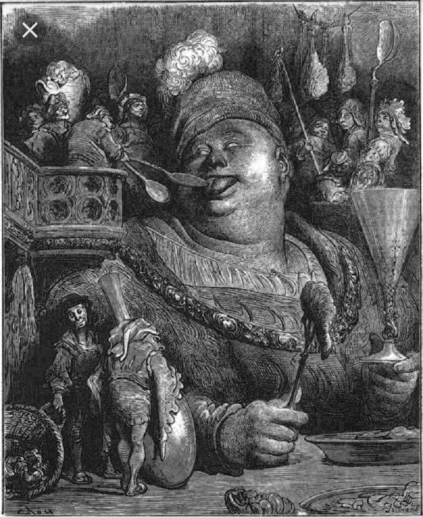
Boris Kustodiev’s work is such a satirical one. While the so-called “revolutionary” avant garde purports erasing and replacing everything of classical, Kustodiev does something radically different: he appropriates a grotesque mode in foisting the finest satirical elements into the classical. His well-known work, The Merchant’s Wife, with its finest grotesque elements (the fullness of the table with food and the obesity of the woman implying the unrestrained soul) reminds us the odious features in Peter Greenaway’s The Cook, the Thief, His Wife & Her Lover (1989).
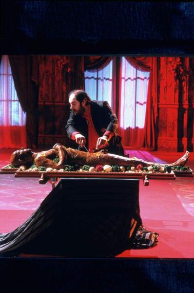
The Gargantua character of the novels by Francois Rabelais (1494-1553). Illustration by Gustave Dore (1832-1883).
The character in Rabelais’ work was obviously a feudal one. Kustodiev’s woman character, however, she looks somewhat like a commercial capitalist as the name of the painting indicates too.
But there is a tiny intriguing detail in Kustodiev’s painting: a cat standing near the woman.. ..and we can well think that this cat is carefully chosen to replace the servants who used to offer food to Gargantua. And then, here is the surprise:
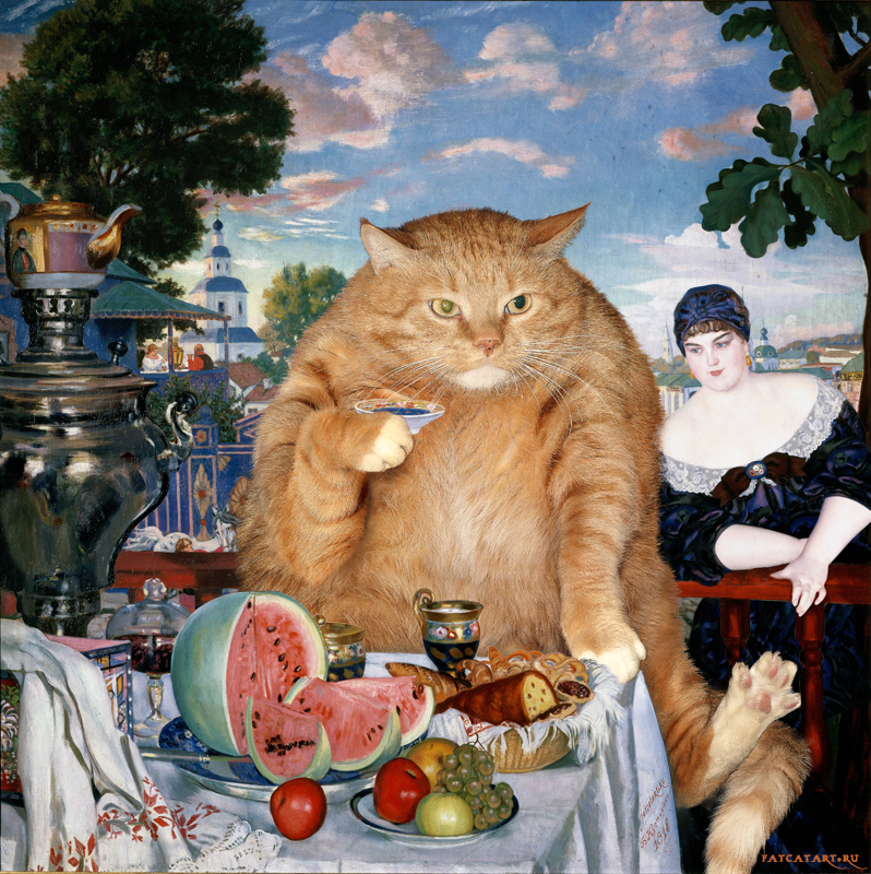
The obese woman is replaced by the cat.
Over the course of historical and social evolution, servants disappear, cats appear alongside blue bloods, and consequently cats replace them.
This is the negative dialectic of master and servant.
As long as the fantasy remains at work in circulating the same banality —the tailored color revolutions and so on— the picture remains colorful either by cheap tricks to deceive censorship for bare propaganda:
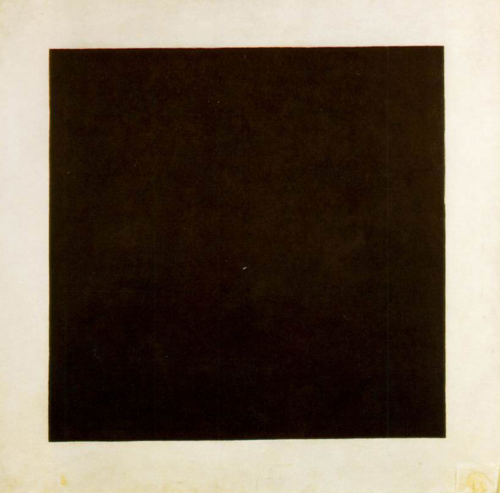
This gap of distructive times accompanied by the ‘colorful’ in the imaginary ended up with a return to hard work in combination with artistry. The rise of Socialist Realism, contrary to common view, wasn’t simply the imposition of a ‘communist dictator but the revival of authentic art finding its roots as ingrained by the circle of artists affiliated to the Association of Artists of Revolutionary Russia. A real revolution is never colorful, as it began in 1923 in Turkey and then in 1927 in Russia (there is no typo here, we truely meant 1927, not 1917). And here’s what the smart reader should see the gray behind the satyric colors of Kustodiev. We guide them by a tiny white script piercing through the painting. A quote by Prof Slavoj Žižek:
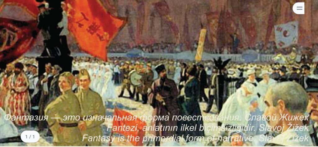
The quote implies the photo on the back cover, that is a Real Revolution, the Kemalist Revolution.
In Lacanian psychoanalysis, the dreams (the black and white) show the unbearable Real. The actual world wherein we are ‘awake’, on the contrary, is not the Real but it’s the ‘reality’ driven by our fantasies (or ideology). Ideological subjects cynically perpetuate and reproduce the reality for distancing themselves from the Real. The reality is the product of the imaginary and it’s colorful. The Real, by contrast, is hard, bitter and gray.
It is how that hardly-seen quote defines the principal ambition of the academic project represented in this book: it aims the execution of a ‘negative history’, rather than the study of facts and events, it aims the study of the ‘lack’ in the narrative and divulge how such lacks shift throughout the history of historiography — it stands into the black of the book ridge, jumping back and forth between the front and the back covers.